The techniques of slicing and projection are powerful tools in analyzing geometric figures and also in visualizing complicated data sets. We illustrate the application of these techniques to data visualization by presenting an extended example that uses many of the topics of this chapter and the previous one.
For a major research project in paleoecology,
Professor Tom Webb and his co-workers in the Geological Sciences Department at Brown University are studying climate changes over thousands of years by tracking the changing vegetation. Their typical data come from counting pollen grains in cores of lake sediments. Within these long vertical cylinders of packed soil, the pollen grains are preserved in temporal order, the oldest material lying in the lower part of the core and the more recent material lying near the top. To verify the chronology, the sediments are radiocarbon dated. By examining the abundance of different types of pollen, the researchers can tell the distribution of different varieties of trees, herbs, and grasses. In particular, they can tell whether the land was forest or prairie by comparing the amount of oak or spruce pollen to the amount of forb pollen from prairie grass.Traditional studies in this field have usually analyzed readings at a single site. Researchers count the pollen grains in different layers of a sample core, knowing that the deeper down in the core, the further back the layers go into the history of the site. The abundance of forb pollen at the site is plotted in a time series, a graph where the horizontal axis indicates the time when pollen was deposited and the vertical axis gives the percentage of pollen. This visual presentation of the data can show how the abundance rises and falls over periods of thousands of years. But this single time series cannot show how changes at this particular site are related to the changes at nearby sites. Perhaps we happened to choose an isolated lake where a bog was forming, which induced vegetational changes not at all representative of the broad area surrounding it.
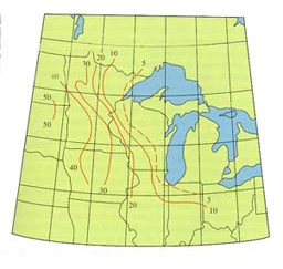
Isopoll curves connect points with the same percentages of forb pollon 6000 years ago. Each curve represents a slice of the four-dimensional data.
To eliminate this possibility, we could compare the time-series information from one site with that from another nearby site. If we drew the graphs on transparent sheets, we could overlay the two graphs to see where changes in one site are located to the right of those in the other, indicating that the changes occurred later in time, and in general we could compare the relative shapes of the graphs to see if they exhibit the same overall behavior. We could even take the difference of the values in the two graphs to make even clearer the places where the two readings differ significantly, a process that goes under the name high-frequency filtering.
If we have a sequence of sites along a transect, for example a path up a mountain slope or along some arbitrary boundary line like a circle of latitude, then we can stack up the graphs corresponding to all of these sites and get an idea of the changes in vegetation along that entire transect. The collection of transparent sheets displaying the graphs will define a three-dimensional "viewing box" with one axis representing time (or depth of the core), another representing space (distance along the particular path), and the third giving the abundance of one or more types of pollen. If we color code the different varieties of pollen, then we can display several of them on the same three-dimensional diagram. As before, we could take the difference of two of these graphs to exhibit more clearly where the abundance of forb pollen exceeds, for example, that of spruce pollen. The higher dimensionality of the display enables us to deal with more data simultaneously and to see relationships that might not be apparent in tabular displays of the data or in isolated time series.
But the data set in reality is of even higher dimensionality. Sites are spread over an entire region, not just up a mountainside or along a transect. We have a two-dimensional region with a two-dimensional time series of forb abundance versus time at each site within the region. The data set is four-dimensional. How do we deal with such a collection?
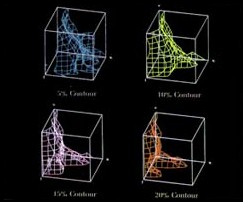
These three-dimensional graphs show four surfaces formed by different concentrations of forb pollen.
We would like to present our data in such a way that we can stop the progression along three-dimensional graphs for increasing longitude and examine one particular three-dimensional display in greater detail. We would like to be able to view nearby graphs at the same time, and to achieve some sense of the whole. The solution is provided by the device of projection, one of the standard ways of converting configurations in three-dimensional space into two-dimensional representations on a computer screen or simply on a sheet of paper. If we project portions of the four-dimensional display into three-space, we obtain a sort of overlay effect, as we see two nearby three-dimensional objects overlapping in three-space, with a small shift along an axis, much the same as the effect of drawing a cube by first drawing the bottom square and then the top one, shifted slightly in an oblique direction. Studying such two-dimensional representations of configurations in three-space is the necessary preliminary to analyzing the analogous three-dimensional oblique projections of configurations in a data space of four (or more) variables.
We can slice another way by fixing the time coordinate. We then have a three-dimensional coordinate system where the horizontal plane gives the region over which the readings are taken, and the height of the graph above any given point is the abundance of forb pollen at that particular time. The heights at different points form the curved surface of a function graph in dimensional space. As we change the slice in the time direction, we generate an animated cartoon showing the changing distribution of pollen over hundreds of years or more. We could display two pollen types simultaneously, perhaps using colors to distinguish the surface of forb pollen from that of the oak or the spruce. A film or videotape of the changing configuration would give an excellent presentation of the data from one viewing point. Ideally we should be able to stop the film at any point and "walk around the graphs" to determine exactly how the various quantities are related at a particular time. Some time in the future, we may be able to display the graphs in holographic motion pictures, so that each viewer could make his or her own exploratory movements as the film progressed. But even with such a display we would want to have the option of slowing down or stopping the film so that we could investigate a particularly interesting phenomenon at our leisure.
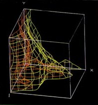
One three-dimensional graph shows surfaces for two different pollen concentrations.
Note that we do not have to take our slices perpendicular to coordinate axes. If we want to examine the data collected along the course of a river valley or even up a mountain ridge, we could slice out a vertical strip over a curve in the two-dimensional region, then flatten it out into the plane for more convenient viewing. The effect is something like a bamboo curtain with three ink markings on every rod. The curtain is curved in one direction so that it fits over the base path, but we might want to flatten it out against a wall so that we could see more clearly how the abundances vary as a function of our position along the transect.
One more kind of slicing is valuable in analyzing data sets in three and four dimensions. Instead of fixing a particular space or time coordinate, we can slice by the coordinate that indicates the abundance of pollen. This means that over the entire domain, for the entire range of time, we might indicate the points at which the abundance of forb pollen is some specific percentage, say 20 percent. Plotting such slices for different abundances yields a series of contour surfaces. On our three-dimensional domain we can attach a number to each point indicating the concentration of pollen at that place and time. We can then connect points of equal concentration, and in general we expect these to fit together in surfaces. If we have 20-percent forb pollen at a particular point, we expect that nearby points will have a 20-percent concentration either at the same time or shortly before or shortly afterward. Thus the data points for nearby sites should fit together to form a small piece of surface over a neighborhood. Of course at a particular site there might be several times when the abundance was exactly 20 percent, so over a neighborhood of that site, the 20-percent contour surface might consist of several pieces. It may be that these pieces come together as we move further from the original point, and the actual arrangement of points in the contour surface might be quite complicated, just as the 200-foot contour line on a landscape might be very involved, if not in the Midwest then certainly in a place like Monument Valley.
There is another problem with this mathematical model. Our precision of measurement is not usually such that we can tell which points have an abundance of exactly 20 percent. At best we can hope for an approximate value, so we may more realistically ask when the abundance falls within a certain tolerance, say between 15 and 25 percent. Instead of a precisely defined surface, we then have a rather indistinct region that contains the surface we are interested in. Often the shape of this region can already give us the information we need to analyze the composition of the flora in a given region over a period of time. There are various averaging techniques which can be used to present these data more clearly.
Once we have a representation of the 20-percent surface, we can investigate it in different ways corresponding to methods used by mathematicians to analyze geometric loci in three-space. Once again the key approaches involve projections and slicing. We can slice by a particular time and see what the 20-percent contour looked like then, and we can try to determine at which points the contour was advancing most rapidly, or where it was receding, questions connected with the gradient of a function of two or three variables. We can "ride the crest" and imagine the progress of 20-percent forb surface as it headed east 8000 years ago.
We can overlay several different data sets to give us a more vivid picture of the interaction of different species. We can look at the 20-percent forb contour in comparison with the contours for 10-percent red oak or 15-percent blue spruce. Or we can color the 20-percent forb surface to indicate the distributions of these other types of pollen, from a light pink to a deep red for the increasing levels of oak pollen, or light to deep blue for the spruce. If we overlay the red and the blue ranges, we obtain a collection of shades of purple, and a glance at a color key could tell us exactly what abundances of red and blue would produce that shade. In this way — by getting a feel for what the data can tell us — we are even more significantly increasing our ability to handle data sets of greater and greater dimensionality. We can construct theories to account for the regularities we perceive, and we can test those hypothetical constructs by further exploration of our data and of similar data sets collected elsewhere. As computer technology goes forward we have new and powerful tools to aid us in this enterprise, and we can look forward to greater and more imaginative insights in the future.
|
|